Tobie George
Brand Consultant
Brand
Architecture
Identity
Language
Refresh
Rollout
Strategy
Workshops
Campaign
Art direction
Copywriting
Media planning
Design
Motion graphics
Packaging
Publications
Signage
Website UX

Tobie George
Brand Consultant
Brand
Architecture
Identity
Language
Refresh
Rollout
Strategy
Workshops
Campaign
Art direction
Copywriting
Media planning
Design
Motion graphics
Packaging
Publications
Signage
Website UX
hello@tobie.com.au
Boorloo [Perth, WA]
Problem
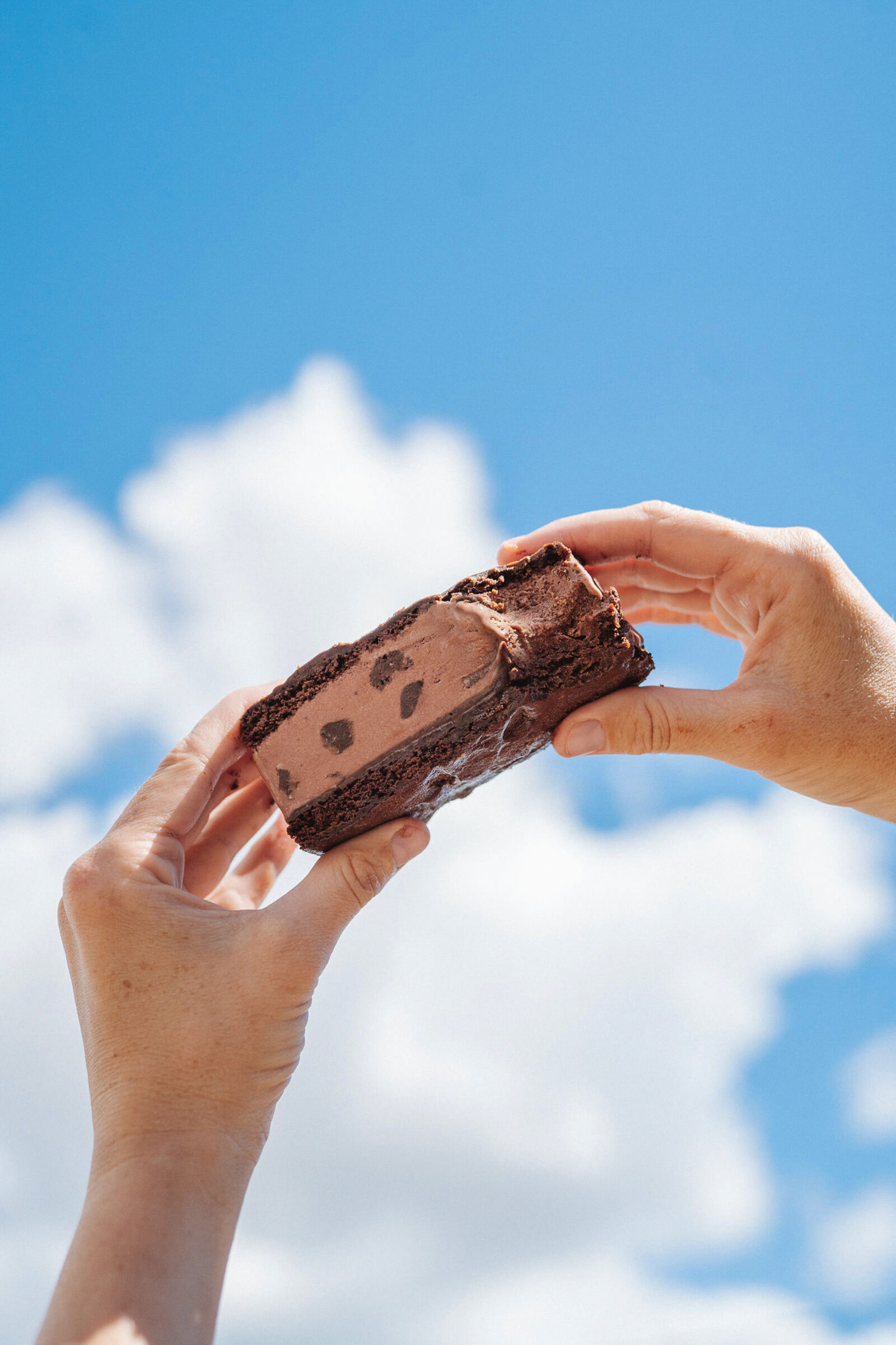
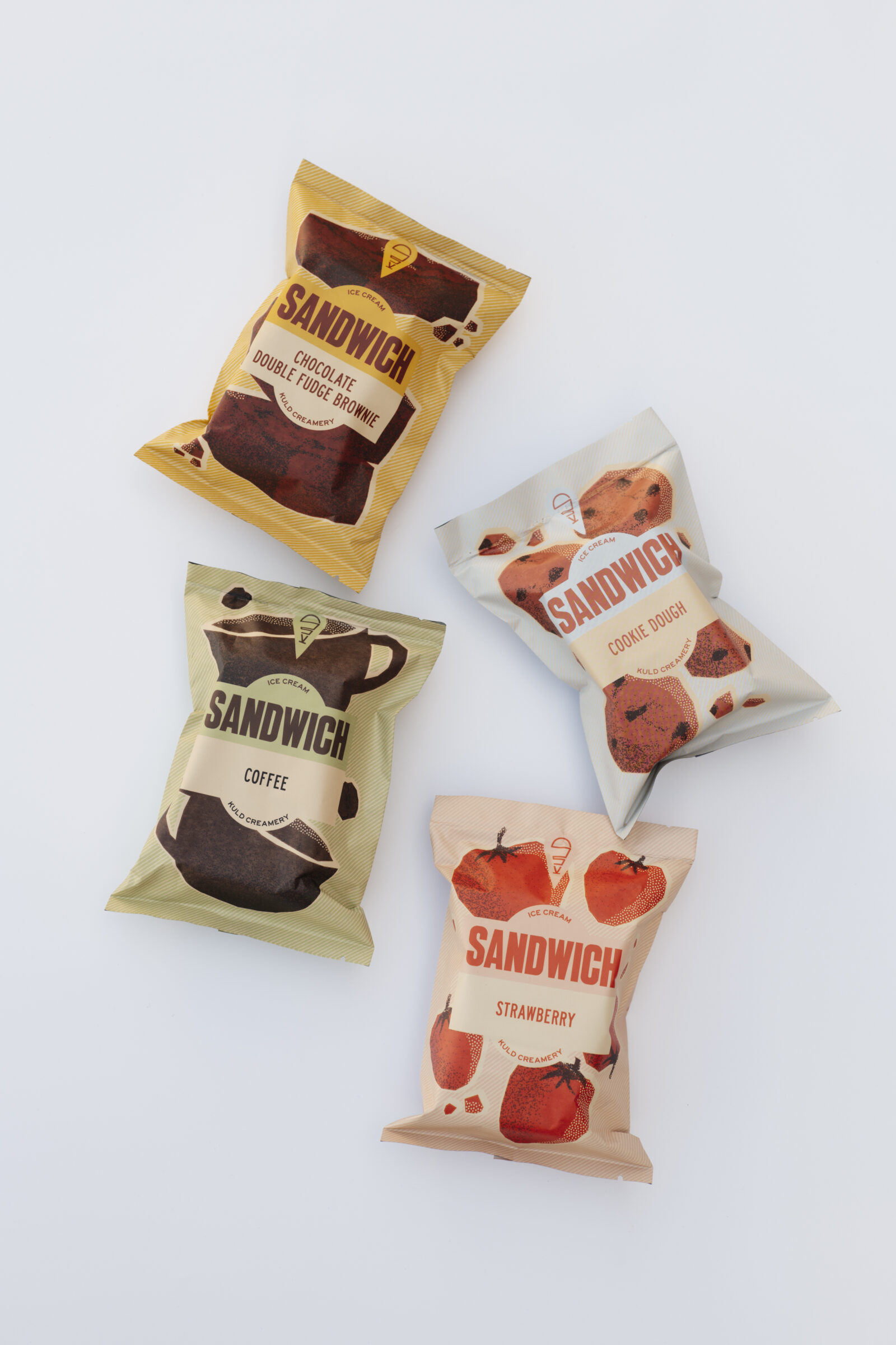
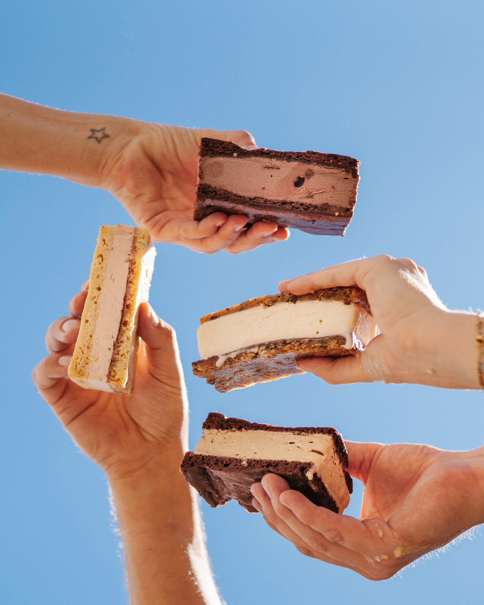
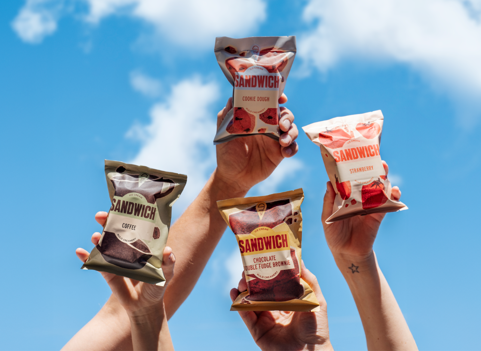
Kuld Creamery had dreamt up a new creation — a nostalgic ice cream sandwich for the next generation of sticky-fingered fans. The range needed to look good in-store, on-shelf and in the freezer. With an initial launch of four irresistible flavours, the goal was to stir appetites and spark memories.
Solution
Big treat energy. This packaging dials up the flavour with illustrations you can almost taste and a wink of retro. Each sandwich features a bespoke design, making it impossible to pass up. With copy as cheeky as the product is creamy, these treats are ready to eat — and hard to ignore.
↓ Scroll
Client: Kuld Creamery
Photos: Rae Fallon, Louise Coghill
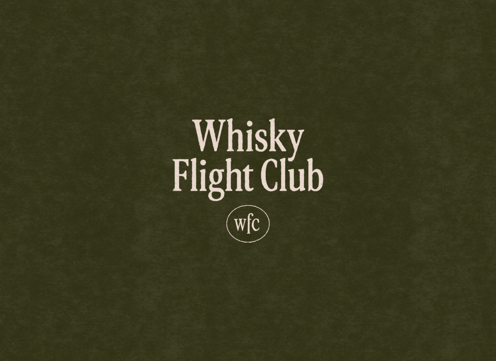
Problem
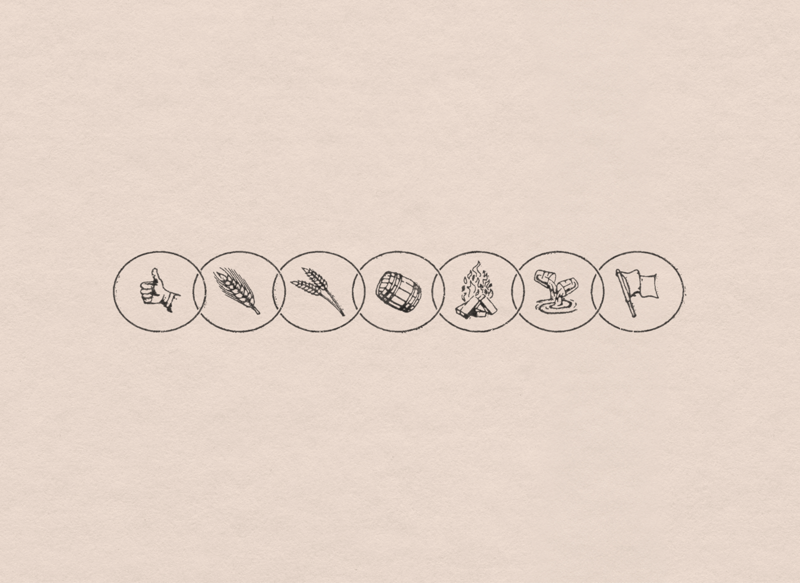
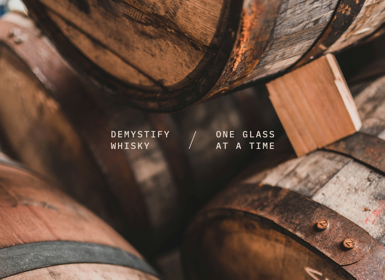
Whisky Flight Club is a subscription-based whisky provider on a mission to take the pomp out of tasting and grow a community of whisky lovers. In a saturated market, they wanted to cut through — without the glossy packaging or overdone tasting notes. They engaged Tobie to shape a brand for their launch.
Solution
Demystify whisky, one glass at a time. This identity strips back the frills, with confident visuals that hold their own without shouting for attention. The brand’s personality runs through both the look and the language. A strong colour palette and a set of hand-drawn pictograms let each monthly release take on a life of its own. At its heart is the simple joy of sharing — because the best drinks drink begin with, 'here, try this.'
↓ Scroll
Problem
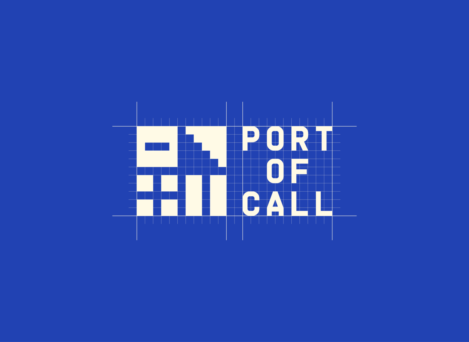
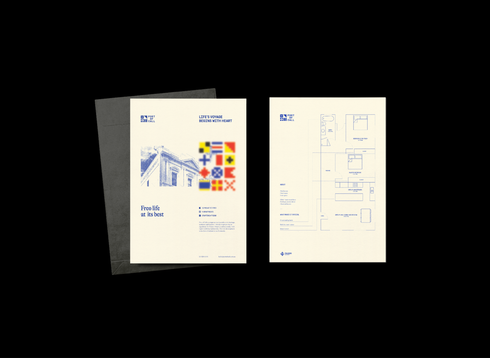
Tobie was engaged to develop a brand identity for a new heritage apartment renovation in Fremantle’s port-side West End. With only four boutique apartments on offer, the brand needed to speak to young professional makers, thinkers and wordsmiths looking for a place, and space, to call home.
Solution
Life’s voyage begins with heart, soul, and a little smarts. This identity nods to Fremantle’s maritime past, but doesn't lose its footing when speaking to a vibrant audience. Typography, grids, and colour lean deeper into heritage. Place and time shape the visual language, seen through the steamship haze of then and the pixel-gaze of now.
↓ Scroll
2022 AGDA Awards, Merit
Student Brand and Identity, Range/Series
Problem
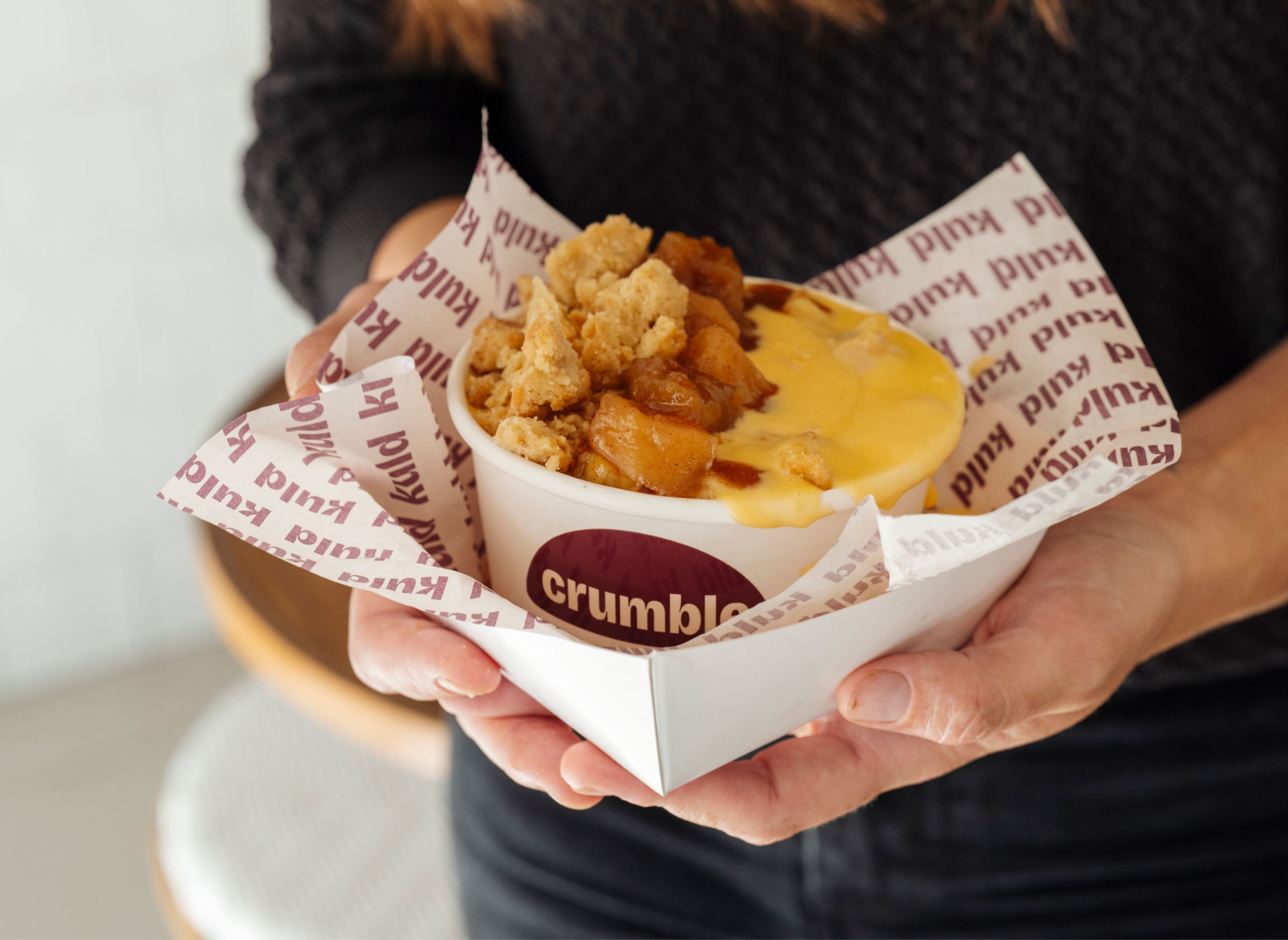
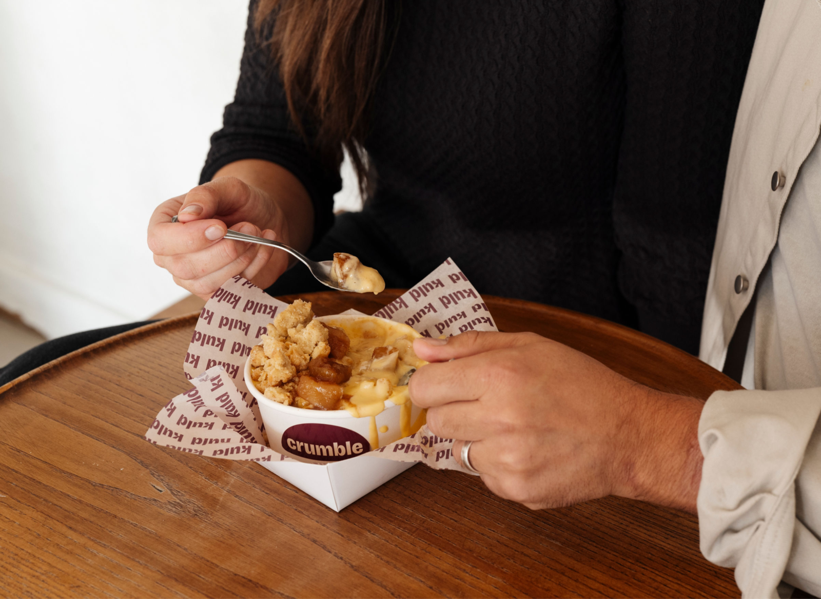
Kuld Creamery is a small-batch ice creamery with stores in Perth and Fremantle. With winter around the corner, Kaitlyn and Mati Kuld laid a master plan for their take on a classic crumble. Kuld Crumble was born — and with it, a move to push their brand further. They engaged Tobie to create a packaging solution in record time.
Solution
One week. Concept to crumble. A playful, proud identity with a warming colour palette and expressive type. The packaging includes two sticker variations and a printed tray liner. Part-shareable, part-unshareable — Kuld Crumble quickly became a viral sell-out.
↓ Scroll
Client: Kuld Creamery
Photos: Rae Fallon
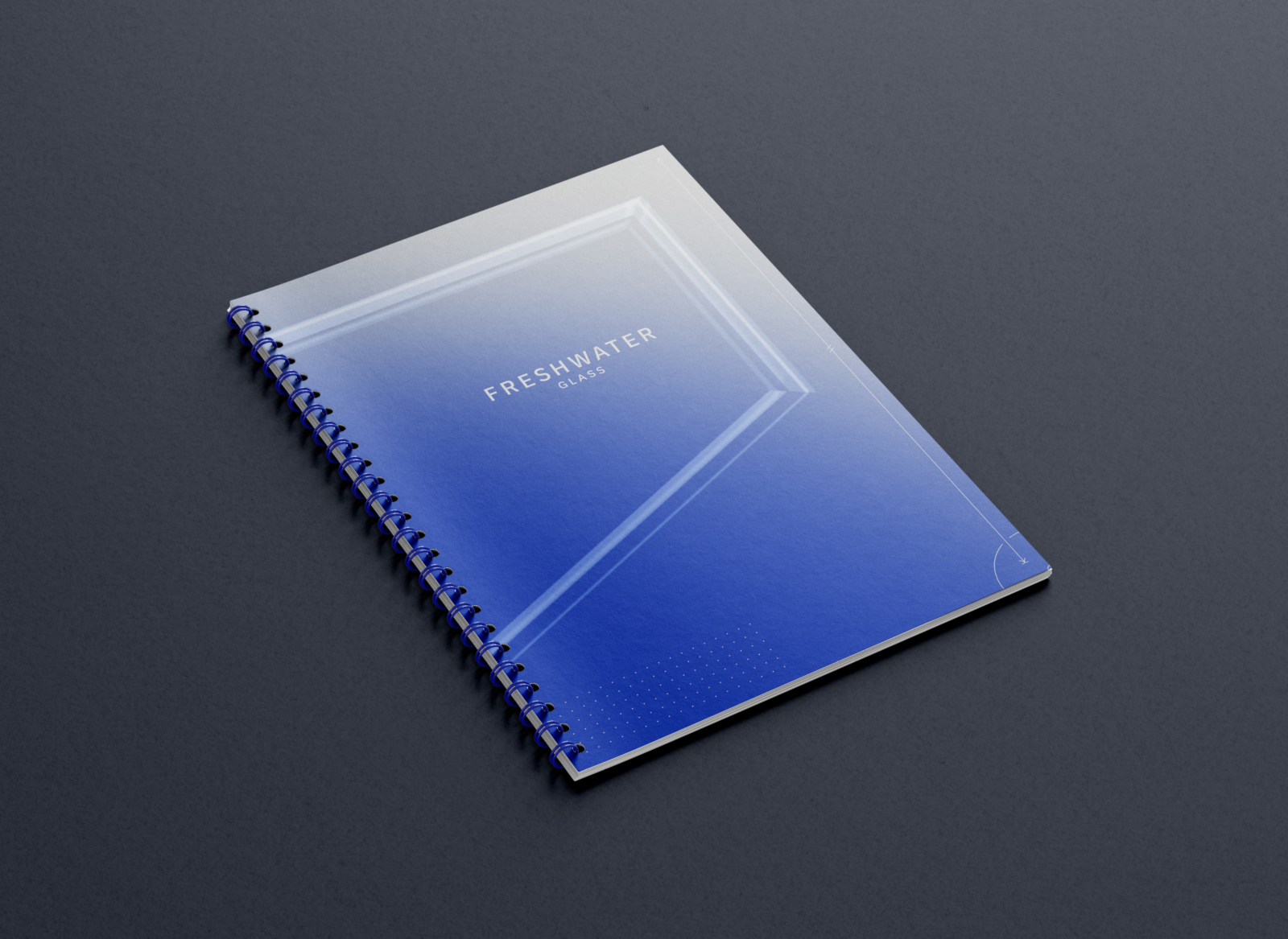
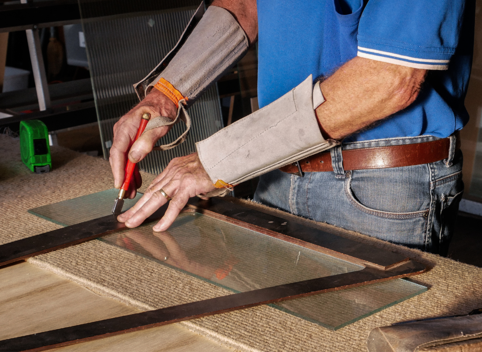
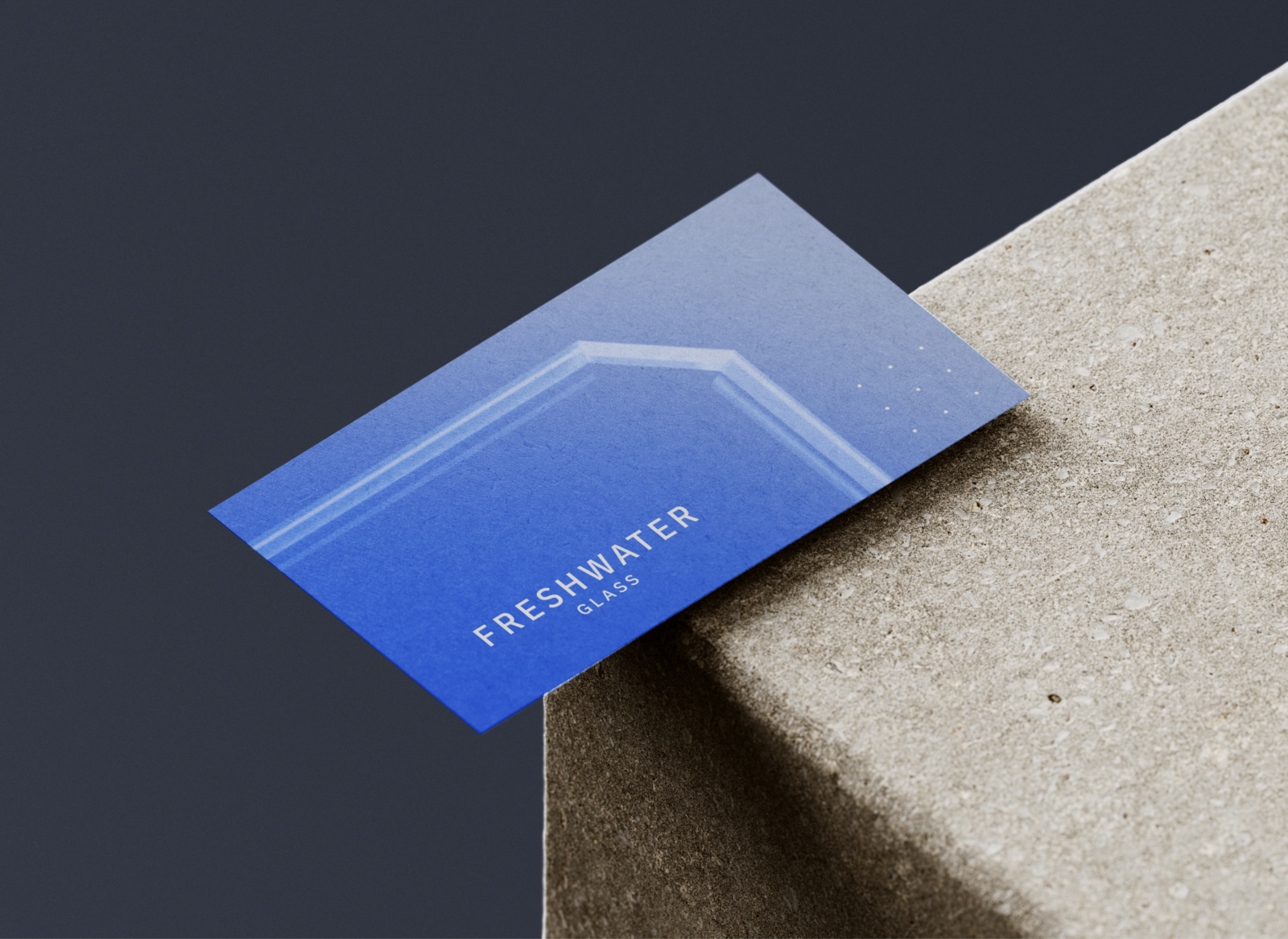
Problem
Freshwater Glass is a Perth-based glazing company with three decades of experience. They asked Tobie to rebrand their business and bring craftsmanship into focus. Competing with cheaper, prefabricated imports meant leaning into contemporary design — backing the value of supporting local.
Solution
Rooted in tradition. Customised by craft. This identity speaks to precision, with layouts that shift around a glass-like visual device. Strong serifs bring structure onto a royal blue that expands into a balanced palette. Photography captures honest character, while iconography and illustration highlight the bespoke.
↓ Scroll
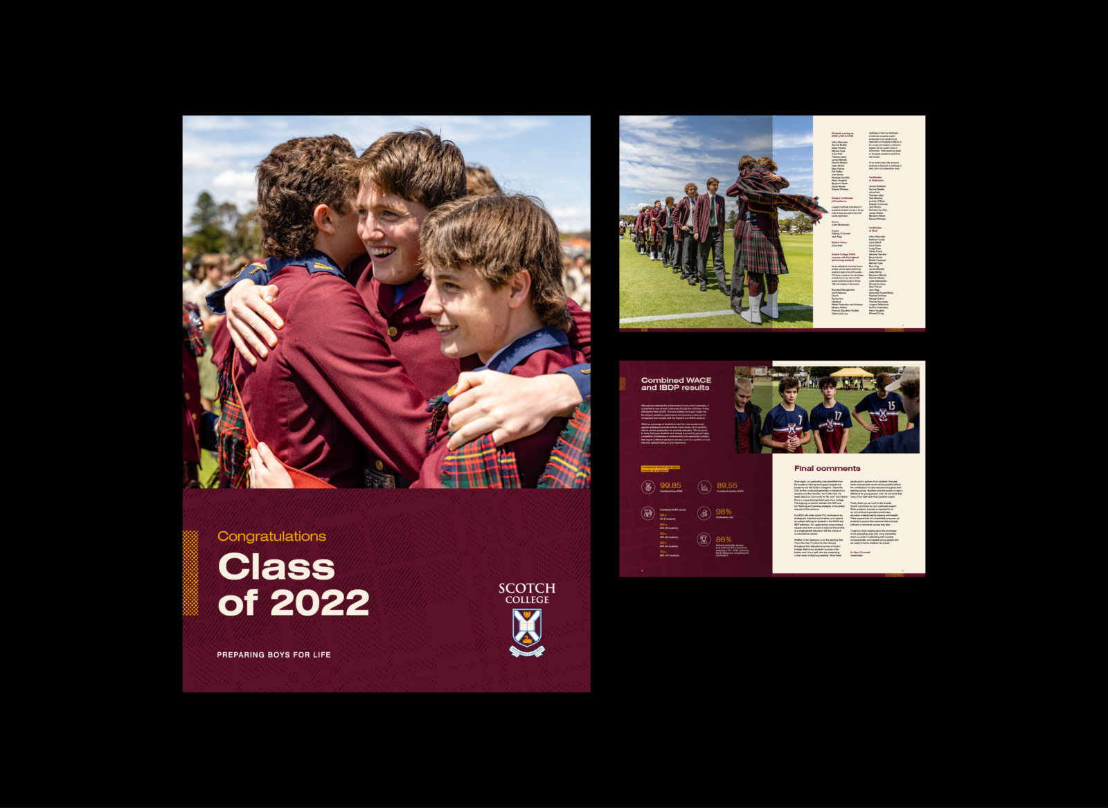
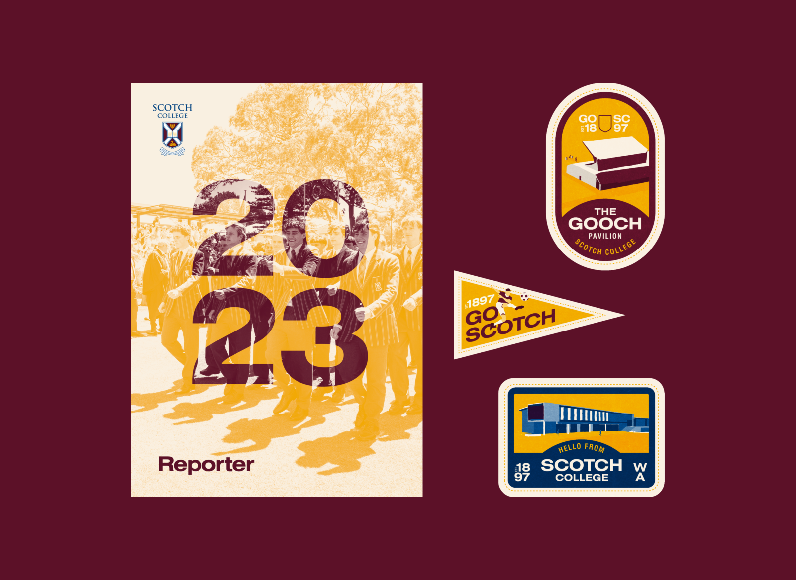
Problem
Scotch College is an independent school for boys in Perth, founded in 1897. Proud of its Scottish roots and dedicated to preparing boys for life, the College sought a refresh of the brand originally developed by Braincells (Claremont, WA). Tobie was engaged to develop a new brand system.
Solution
125 years of tradition — confident, familiar, and evolving. The refresh proved that progress and heritage can co-exist. The crest and colour palette were audited and maintained. New typographic hierarchy modernises the look. A fresh visual language draws from the Cameron tartan and Scottish thistle. The new standards apply to all external branding. For the first time, Scotch has a consistent identity that speaks with clarity and is instantly recognisable.
↓ Scroll
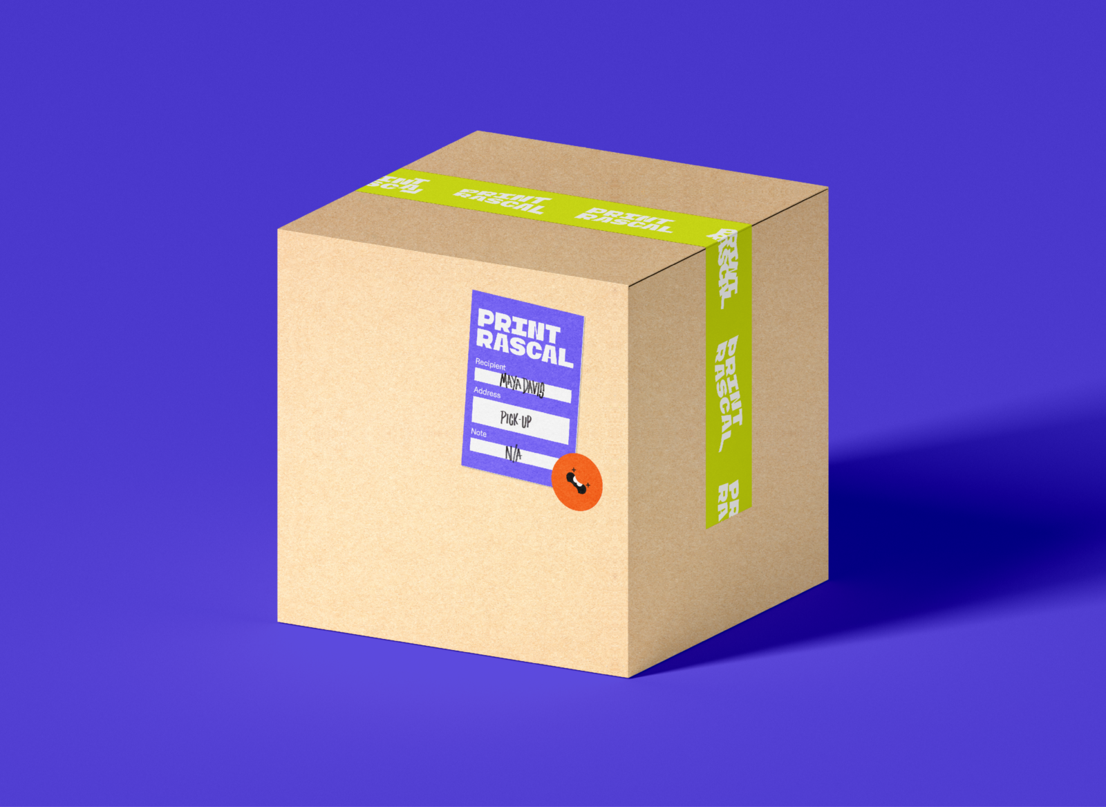
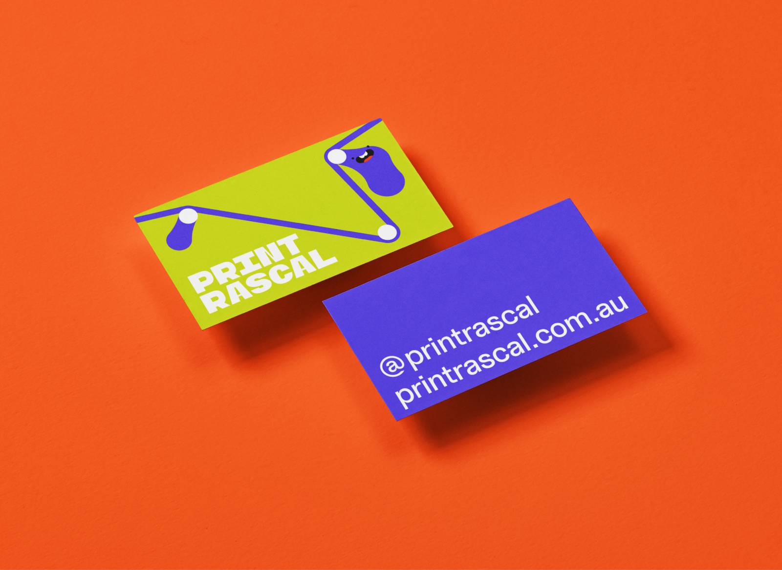
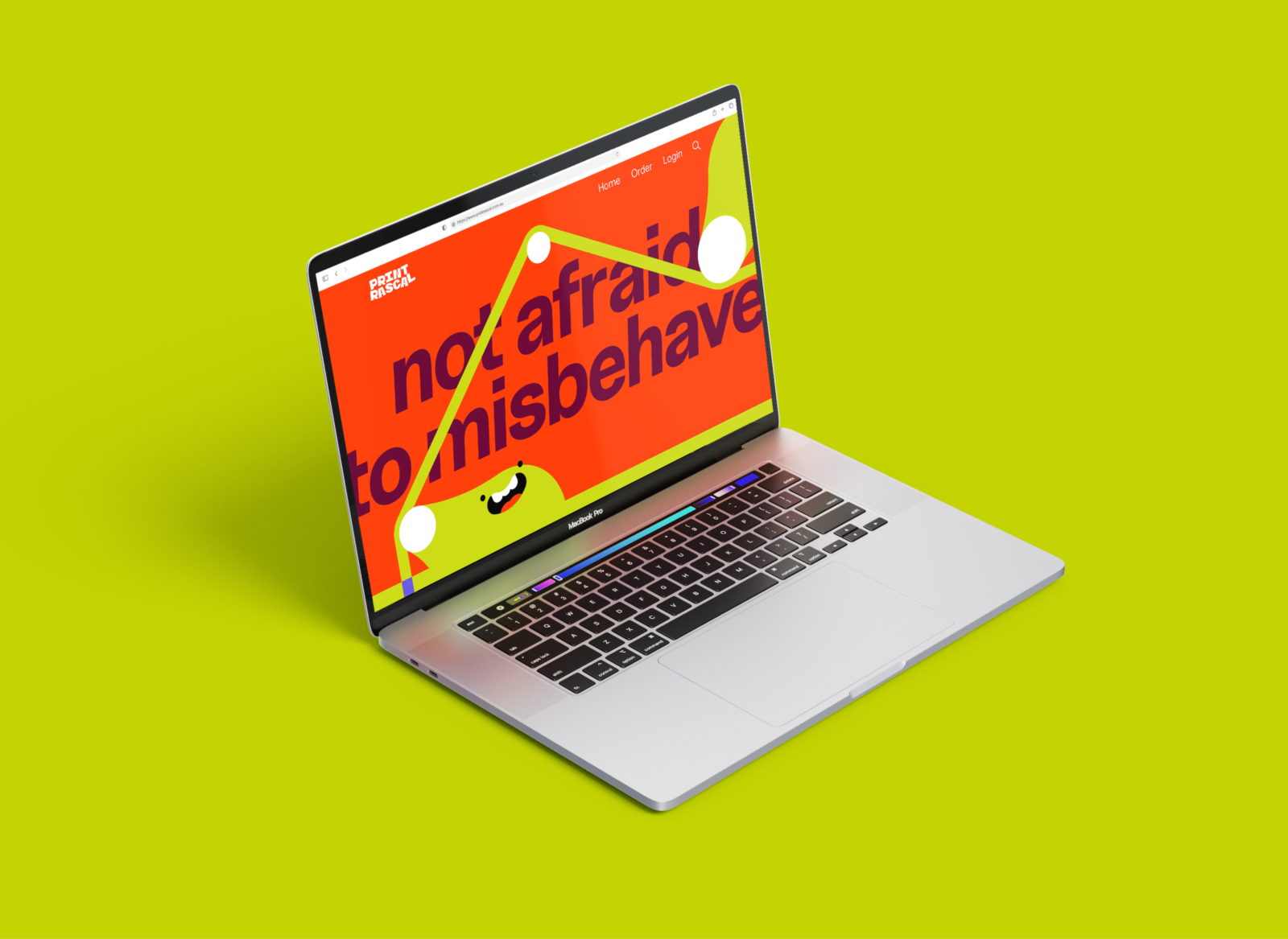
Problem
Print Rascal is a new kind of print shop — fun, friendly, and made for the next generation. Aimed at students and young creatives, the brand needed to cut through big-business noise with an anti-corporate, screen-ready identity. Tobie was brought in to bring out the rascal within print.
Solution
Calling all rascals, rapscallions and rebels. This brand breaks the rules — bold type, retina-burning colours, and a shape-shifting brandmark stitched together by a dangling network of 'rascal' conveyors. Language and visuals are full of attitude but grounded in clarity. Print Rascal is loud, lovable, and ready to roll.
↓ Scroll
2022 AGDA Awards, Finalist
Student Brand and Identity, Range/Series
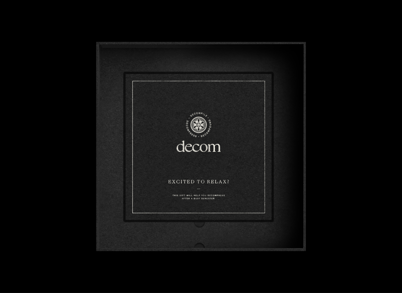
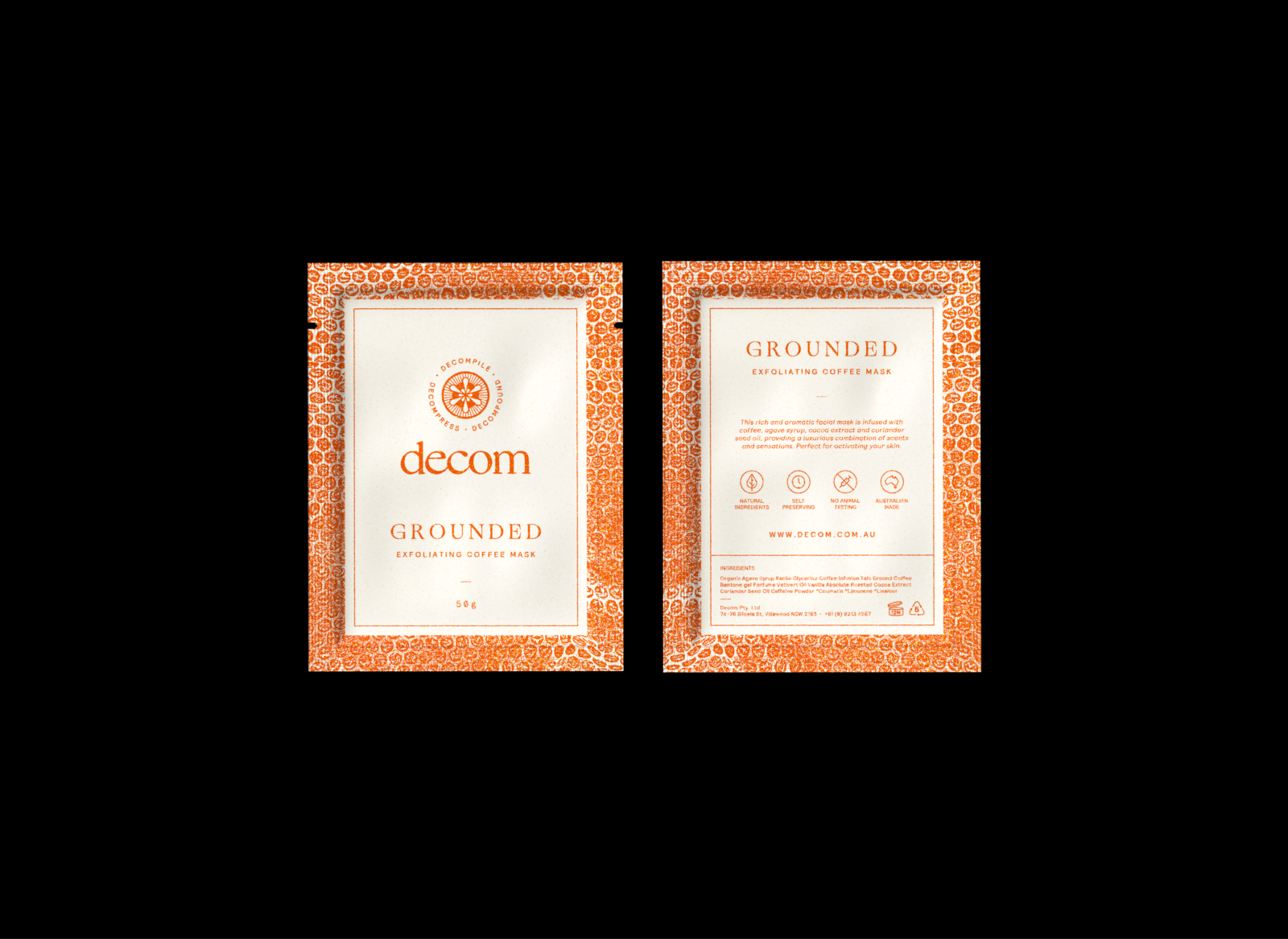
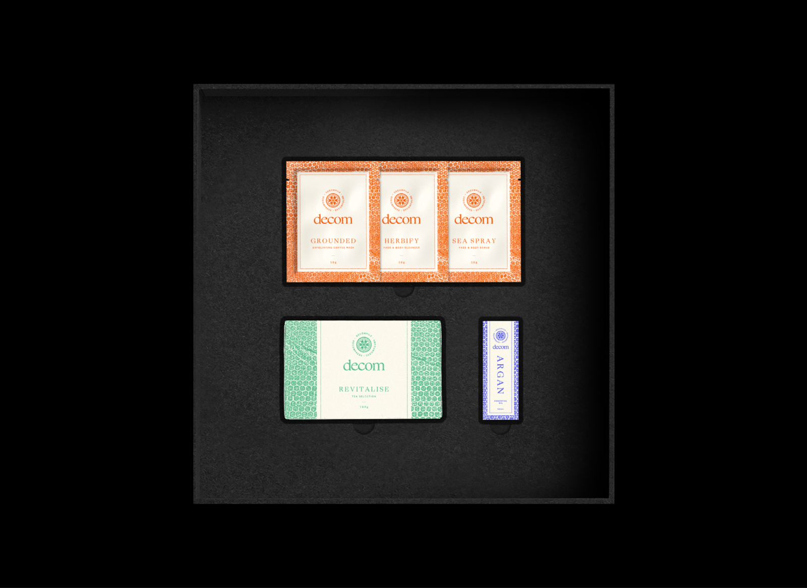
Problem
Decom creates custom gift boxes designed to help students decompress and reset. Taking time for yourself shouldn’t feel like a guilty pleasure — it should be something to look forward to. Tobie was engaged to brand the business, boxes and self-care products.
Solution
Time to decompound, decompile, decompress. Inspired by the joy of downtime, the brand captures the shift from stress to calm. Packaging builds anticipation — from a muted exterior to a vibrant, tactile core. A small gift with a big exhale.
↓ Scroll
2022 AGDA Awards, Finalist
Student Packaging, Miscellaneous
Problem
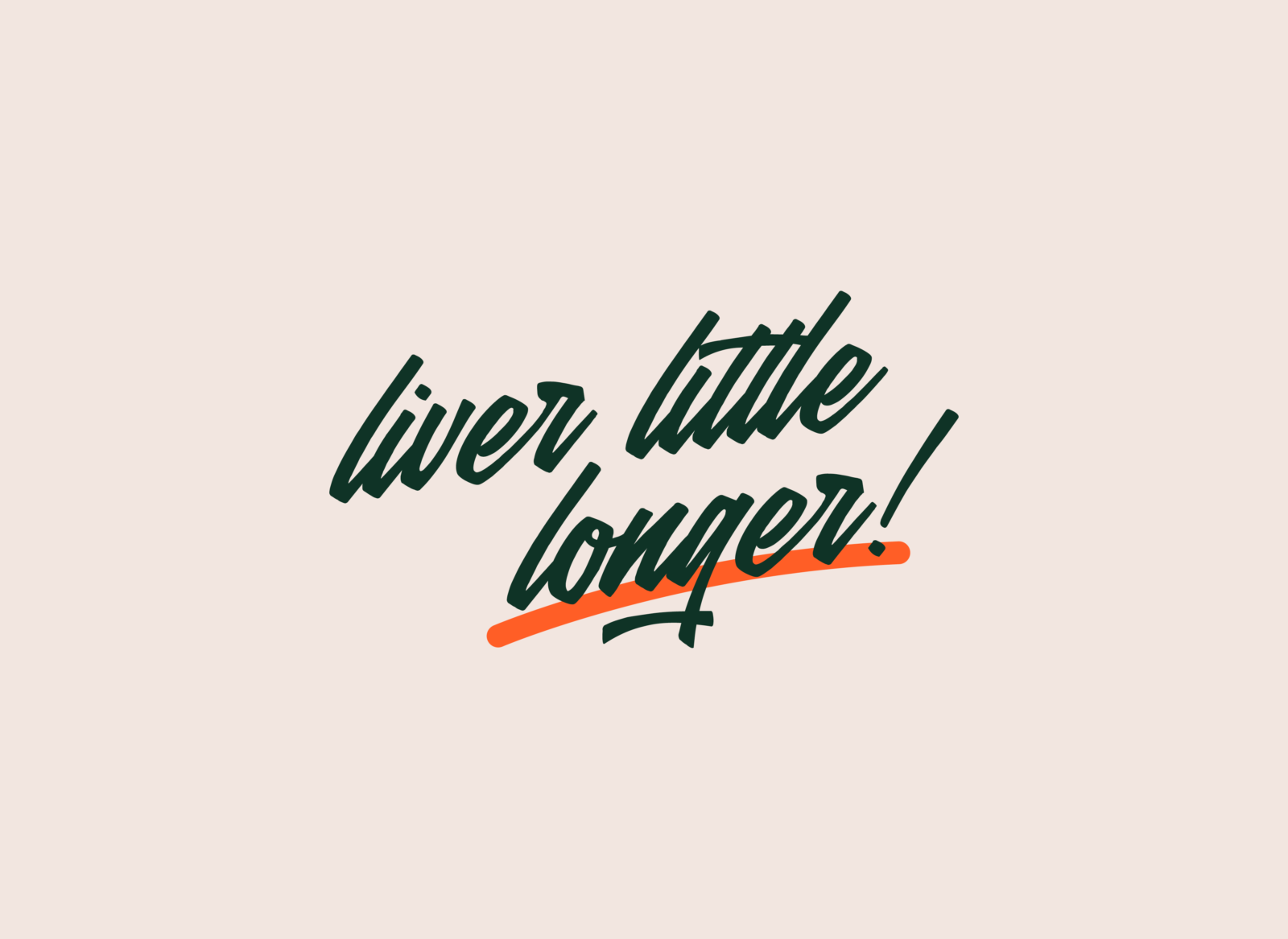
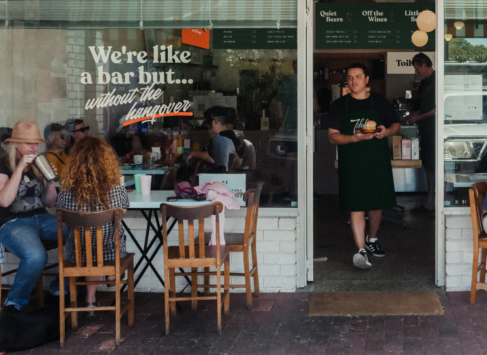
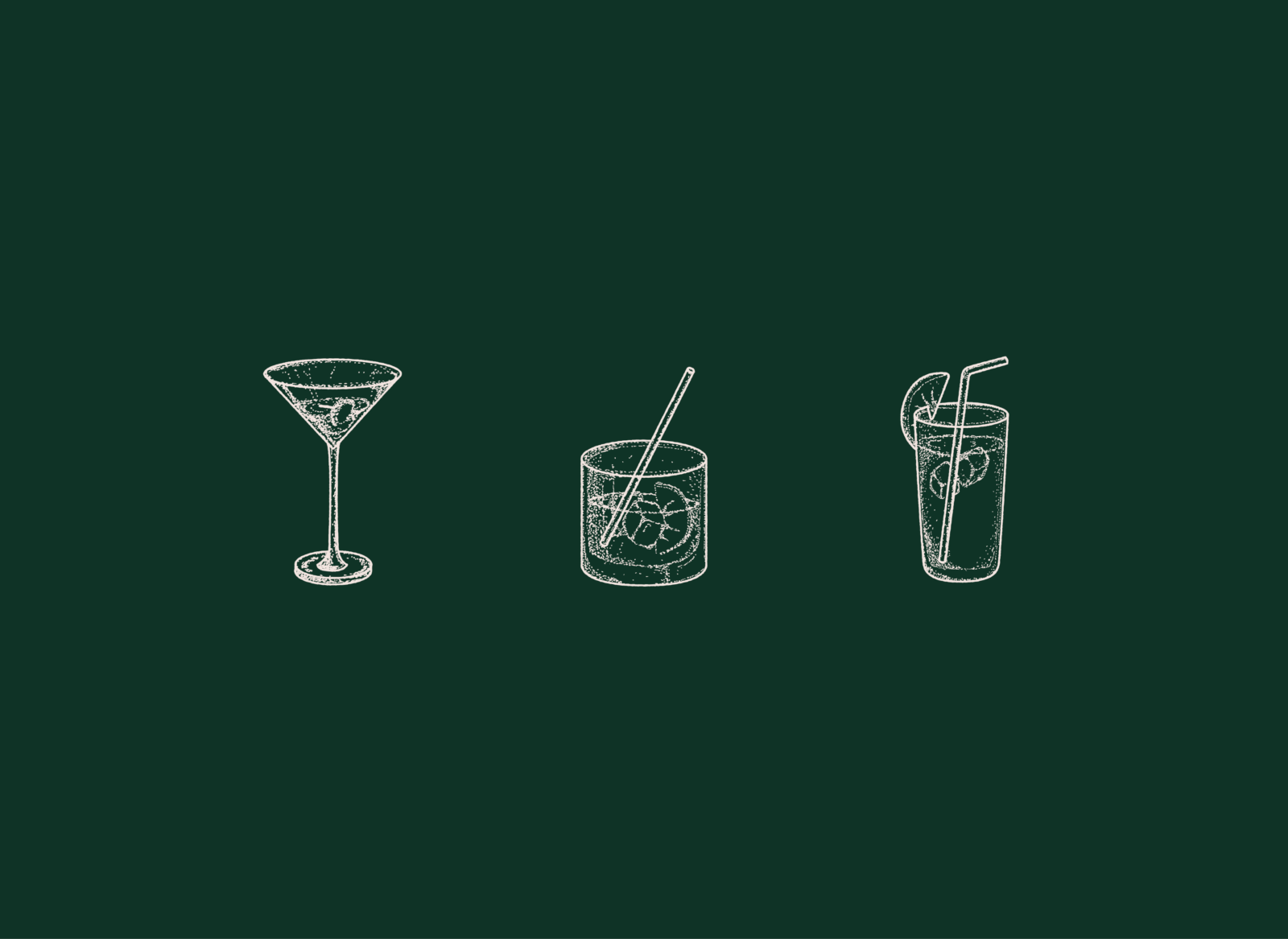
Long before Perth's first alcohol-free bar opened in 2025, Zilch Bar was conceptualised. Their mission: normalise not drinking and celebrate the upsides. With a bar and café opening in North Perth, Zilch needed a brand that said good times — without the clichés of bar culture. Tobie was tasked with bringing the vision to life.
Solution
Zero. Zip. Zilch. A brand built on the milk bar aesthetic, with signwriting at its heart. A liquid, playful wordmark leads the way, backed by punchy colour, a flexible typographic system, and a tongue-in-cheek tone. Honest, upbeat, and full of fizz — Zilch is skipping the booze, not the fun.
2022 AGDA Awards, Finalist
Student Brand and Identity, Range/Series